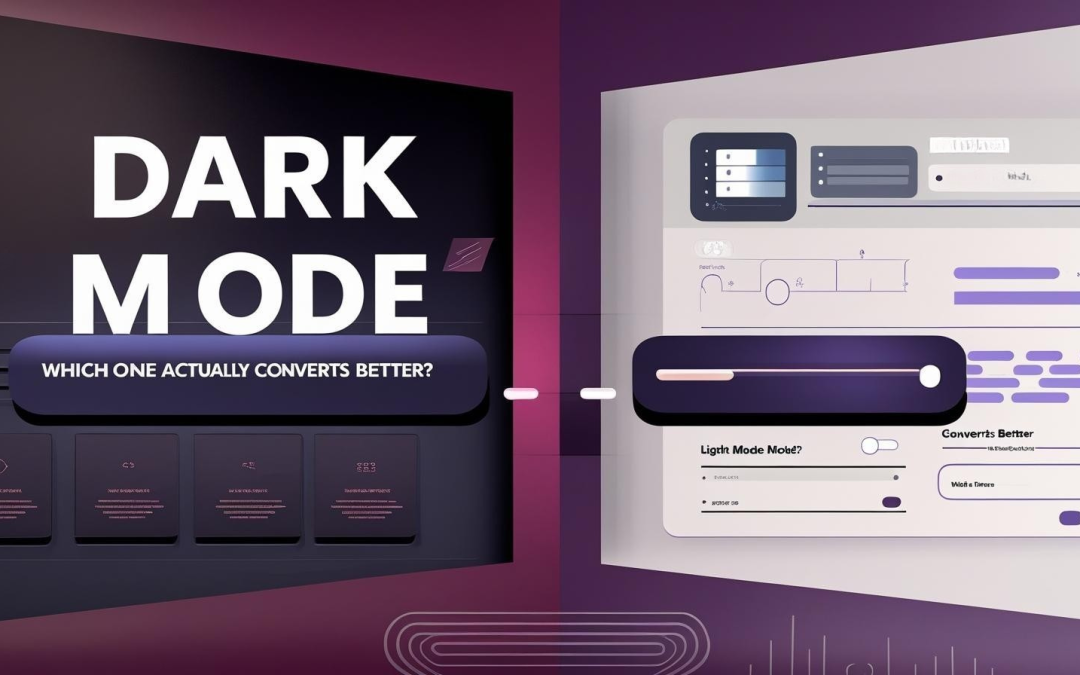
Dark mode design is everywhere right now. From Spotify playlists to iPhone settings, more apps and websites are offering a dark theme. But that raises a big question: does dark mode design actually boost conversions, or is light mode still the champ?
The truth is, it depends. Both styles have strengths and weaknesses. In this post, we’ll break down what makes dark mode design so appealing, why light mode still rules certain spaces, and what the research says about conversions, engagement, and user happiness. We’ll also share tips on how to design both modes so users feel in control and more likely to stick around.
What Exactly Is Dark Mode Design?
Dark mode design flips the standard color scheme. Instead of black text on a white background, it uses dark backgrounds with lighter text and accents. Some people call it night mode or dark theme, but the concept is the same.
It’s popular for three main reasons. First, it reduces eye strain in low light, which makes late-night browsing more comfortable. Second, it minimizes blue light exposure, which may help users sleep better. Third, it conserves battery life on OLED and AMOLED devices because darker pixels require less energy.
This explains why you’ll see dark mode offered in apps where users spend long hours or need a more immersive experience. Think of streaming services like Netflix and YouTube, mobile operating systems such as iOS and Android, or coding environments where developers prefer darker screens during extended work sessions.
And What About Light Mode?
Light mode is the default for most digital platforms, and for good reason. Its bright backgrounds mimic reading on paper, which feels familiar and natural. Light mode performs especially well in bright settings, like outdoor environments or offices with overhead lighting.
Another advantage is tone. Light backgrounds give a clean, professional feel, which is why businesses and content-heavy platforms often stick with it. Visuals such as product photos and infographics also stand out against light backgrounds, making this mode particularly effective for e-commerce and blogs.
Search engines like Google and Bing, most major news outlets, and online stores such as Amazon all use light mode as their primary default.

How Dark and Light Themes Shape Our Feelings
The choice between dark and light mode is not just about looks. Both styles send subtle signals that influence how users feel.
Dark mode tends to feel modern and premium. It’s often linked with luxury, exclusivity, or creativity. That makes it a strong choice for brands that want to position themselves as sleek and forward-thinking.
Light mode, on the other hand, communicates openness and trust. A white background with crisp text feels honest and approachable, which is critical for platforms where clarity and credibility are more important than style.
These cues shape user behavior. For example, a call-to-action button on a dark interface might feel bold and urgent, while the same button on a light background may feel reliable and safe.
Eye Comfort, Accessibility, and Inclusivity
Not all users experience dark and light modes the same way. While dark mode can reduce glare in dim rooms, it isn’t always the most inclusive choice.
Some people with astigmatism report that light text on dark backgrounds produces a halo effect, making it harder to read. Others with low contrast sensitivity may struggle with poorly designed dark interfaces. On the flip side, light mode can be uncomfortable at night, as a glowing white screen in a dark room can cause eye strain.
That’s why accessibility guidelines such as WCAG recommend maintaining strong text-to-background contrast. The rule of thumb is a minimum ratio of 4.5:1. For designers, this means avoiding pure black paired with pure white. In dark mode, deep charcoal with off-white text is easier to read. In light mode, dark gray text is often more comfortable than harsh black.
Inclusivity comes from careful design choices, not from picking one mode over the other.
So, Which Mode Wins on Conversions?
Let’s look at what the data says.
On Mobile and Social Apps
- Engagement: Social apps saw 11% higher click-through rates when dark mode was offered.
- Session duration: News apps with adaptive UI (switching based on time of day) kept users around 14% longer.
- Bounce rates: Dark mode often reduces early exits because users feel more comfortable at night.
On Shopping Sites
- Dark backgrounds make CTA buttons pop. Studies found “Sign Up” or “Buy Now” buttons appeared 20% more noticeable in dark themes.
- Luxury products and lifestyle brands benefit from the premium vibe dark mode provides.
On B2B and Content-Heavy Sites
- Light mode still dominates. One study found 8% more form completions on sites using light themes, thanks to easier scanning.
- Long articles, dashboards, and SaaS tools usually convert better with bright, clean interfaces.
Where Dark Mode Design Shines
Dark mode design really shines when the user experience is about immersion. Apps for entertainment, gaming, and streaming feel less distracting and more engaging with darker backgrounds. Luxury brands also use it to create an exclusive, polished look.
It’s also the preferred choice for late-night browsing, where it minimizes glare, and for users who care about battery life on OLED or AMOLED devices.
Where Light Mode Still Leads
Light mode is the clear winner in spaces where information density and trust matter most. News sites, blogs, and educational platforms benefit from the readability of light backgrounds. Healthcare and B2B platforms rely on clarity to build trust with their audiences.
Accessibility is another reason light mode remains important. For users with vision conditions such as astigmatism, light mode offers a more reliable experience.
Should You Offer Both?
Today, many platforms give users the option to toggle between modes, and that’s often the smartest move. A mode switch communicates flexibility and respect for personal preference. It also signals that your brand cares about user comfort.
The key is making the toggle intuitive. A sun and moon icon in the header is easy to recognize, while saving user preferences ensures they don’t have to reselect their mode every time. Smooth transitions with fade or slide animations help keep the switch from feeling jarring.
Designers should also ensure brand consistency across both modes. Colors, logos, and buttons should adapt seamlessly so the experience feels cohesive no matter what theme the user chooses.

Measuring Which Mode Works for You
Launching both is only the start. Track how each mode affects conversions:
- Conversion rates: Purchases, sign-ups, downloads
- CTR: Are your buttons more effective in dark mode?
- Time on page: Do readers stick around longer in one mode?
- Scroll depth: Are users exploring more content in one version?
- Form completion rates: Critical for SaaS and B2B
- Bounce rate: A sign of initial satisfaction or frustration
- User feedback: Heatmaps, surveys, and support tickets reveal pain points
Pro tip: analyze performance by time of day. Dark mode might crush it at night, while light mode leads during work hours.
The Verdict on Dark Mode Design
So, who is the real conversion champ?
It depends. Dark mode design is perfect for entertainment, retail, and visual-first apps where immersion matters. Light mode wins for content-heavy, professional, and trust-driven platforms.
The smartest move is to offer both, let users choose, and test continuously. That way, you are not betting everything on one style. You are giving your audience control, which builds loyalty and lifts conversions.
Key Takeaways
- Dark mode design feels modern, immersive, and energy-efficient.
- Light mode is clear, professional, and still better for long-form content.
- Accessibility is critical. Neither mode works for everyone, so design carefully.
- The best strategy? Offer both, monitor the data, and adapt.
Bottom line: give users the power to choose. When people feel comfortable and in control, conversions naturally follow.